Lead Generation Forms is an app created by AidaForm. Its intuitive drag-and-drop interface helps you to create and administer many different types of web forms without needing to code:
- Contact Forms
- Registration Forms
- Surveys
- Feedback Forms
- Job Applications
- Quizzes and Tests
And more! After you have created your forms, you can collect the responses, and analyze the response, completion, and exit data, all in one place.
How Can Lead Generation Forms Help Me?
Lead Generation Forms enables you to create custom forms, administer them, and analyze the responses you gather. It can help you:
- Generate leads by collecting contact information
- Gather customer feedback to help you grow your business
- Conduct surveys for customer or market research
- Create custom job applications tailored to your needs
- Analyze your forms’ submission data, exit and completion rate
Pricing
You can try Lead Generation Forms free for 7 days. Following your free trial, you can add it to your Semrush account for $20 per month.
Getting Started
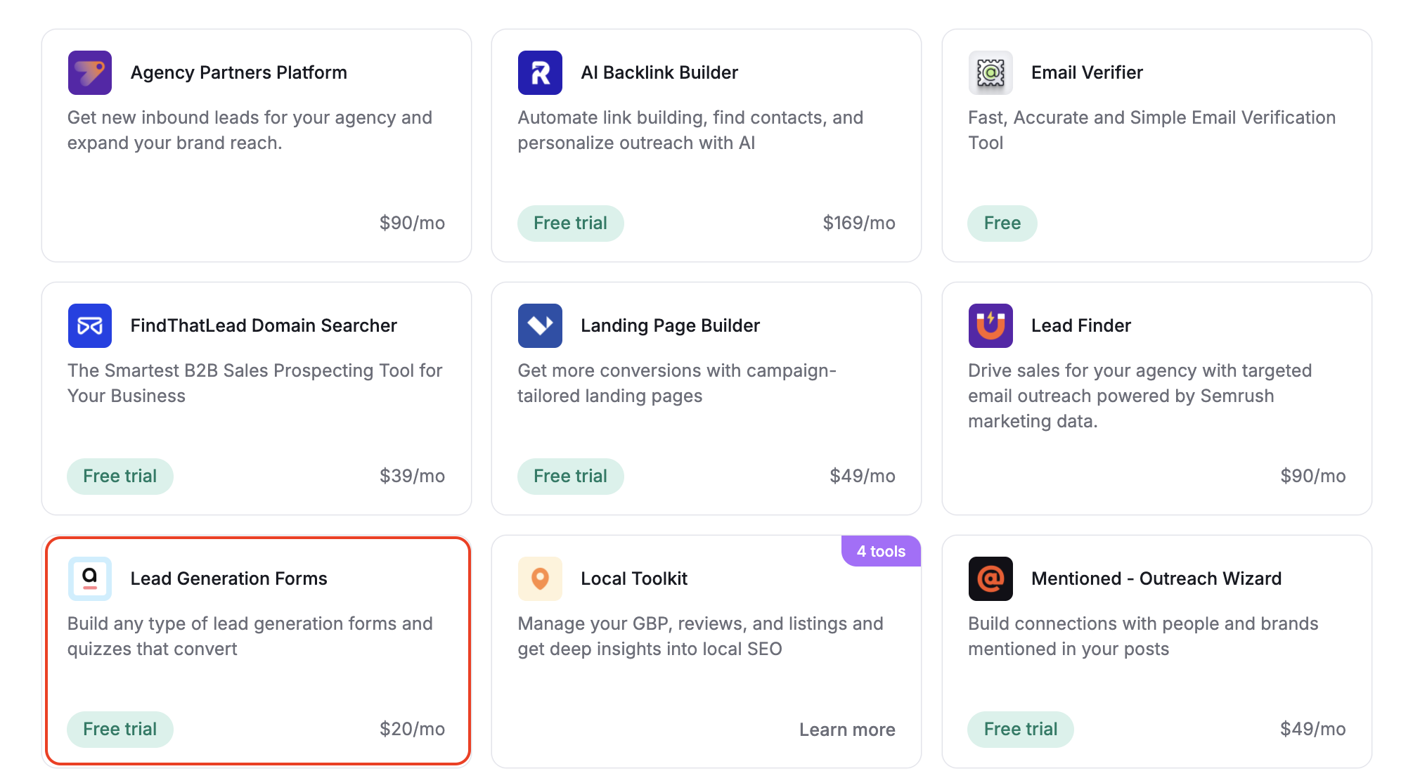
You can find the Lead Generation Forms on your App Center dashboard. First, click on the Lead Generation Forms tile. This will take you to the app’s landing page, where you can learn more about it.
If you have not yet purchased Lead Generation Forms or started your 7 day trial, you will see a green “Try it free” button at the top of the page. Click this button to add Lead Generation Forms to your account.
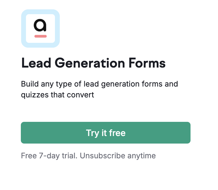
After your free trial concludes, your $20 per month subscription will begin automatically, unless you cancel your subscription. An alert window will pop up asking you to agree to this before starting your trial.
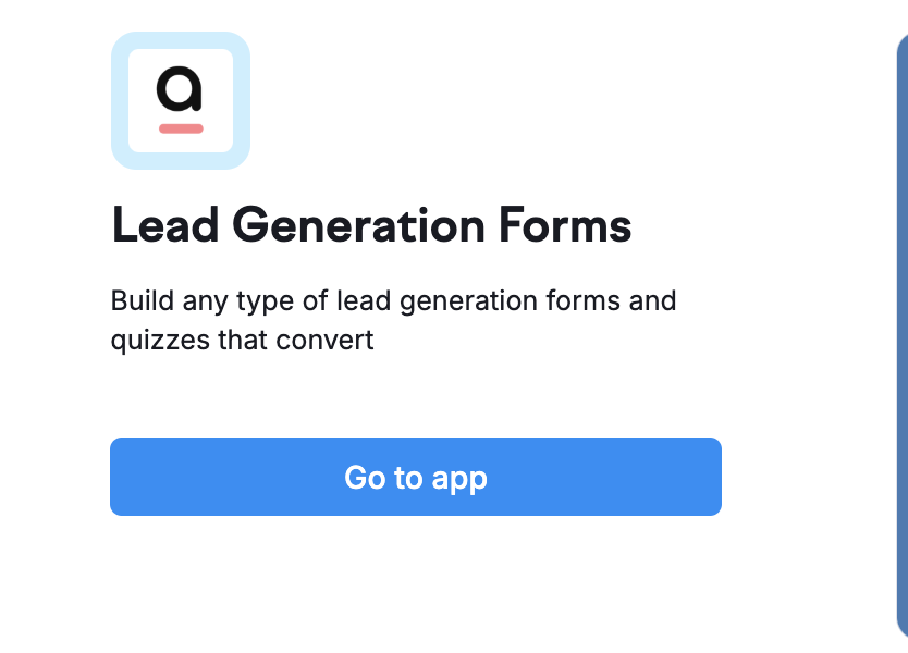
If you have already purchased Lead Generation Forms, you will instead see a “Go to app” button in blue at the top of the page. Click on this button to open the app.
How to Create a Form
The app’s Home page will house all of the forms you create using Lead Generation Forms. To create one, click the “Create New Form” button on the top right.

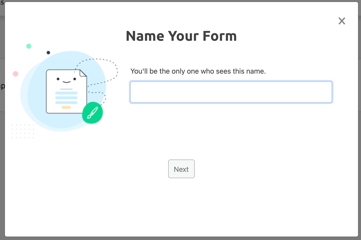
Next, a window will appear prompting you to name your form. Enter a descriptive name in the text field, and then click “Next” to start using the Form Builder.
Using the Form Builder
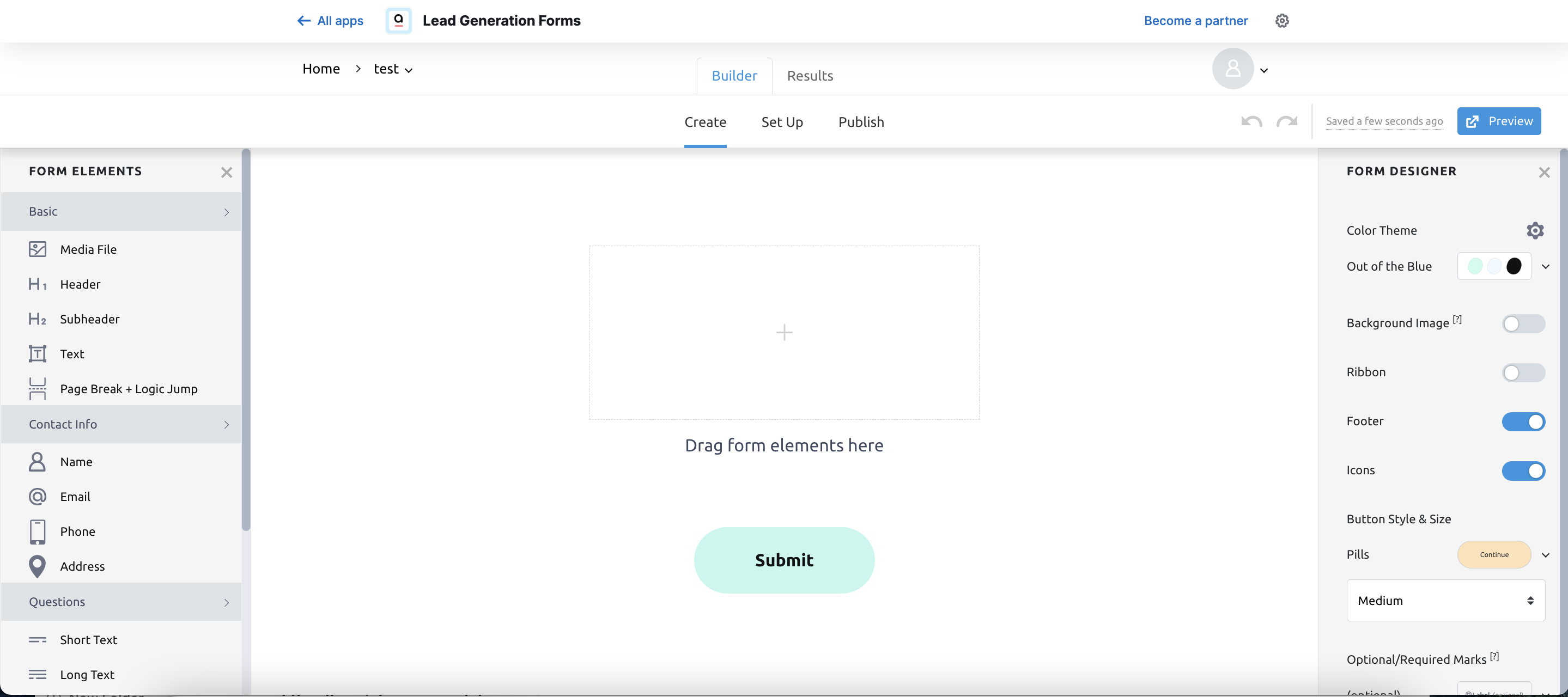
The Form Builder is a drag-and-drop interface that enables you to design a custom form without coding. It contains three tabs: Create, Set Up, and Publish.
Create
The Create tab contains all of the elements you’ll use to design and build your form before it is launched. These options are broken out into two menus: Form Elements, on the left, contains content-based elements, and Form Designer, on the right, allows you to customize the appearance.
Form Elements
Basic
The first section on the Form Elements menu is the “Basic” section. It includes text and formatting elements that are not category-specific. Here, you can upload media, create headers and subheaders, insert text, and insert page breaks.
Media Files
To upload an image, video, audio file, or QR code, first click or drag and drop the “Media File” element into your form, in the center of the page. Then, click the cloud-shaped upload icon.
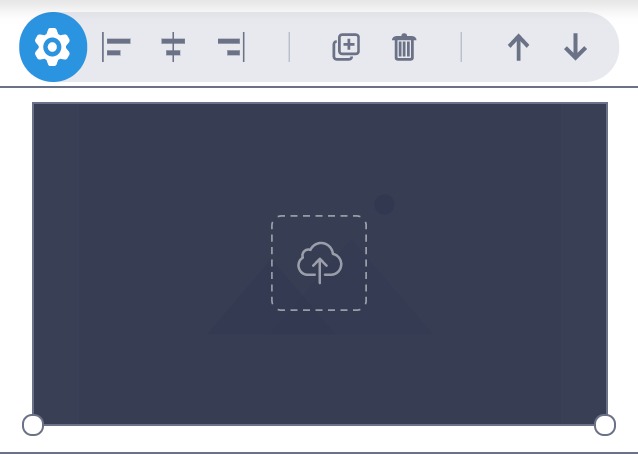
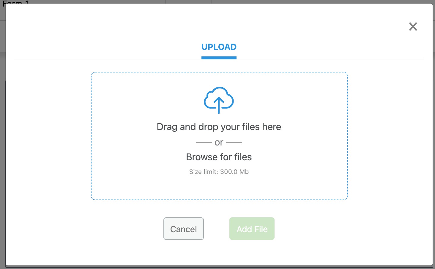
In the window that appears, you may choose to search for a Pixabay image, upload your own, or select a different media type. To search for an image, simply enter a keyword in the search field. If you want to use your own image, click “Upload.”
Once you have selected or uploaded your preferred image, click “Add Image.”
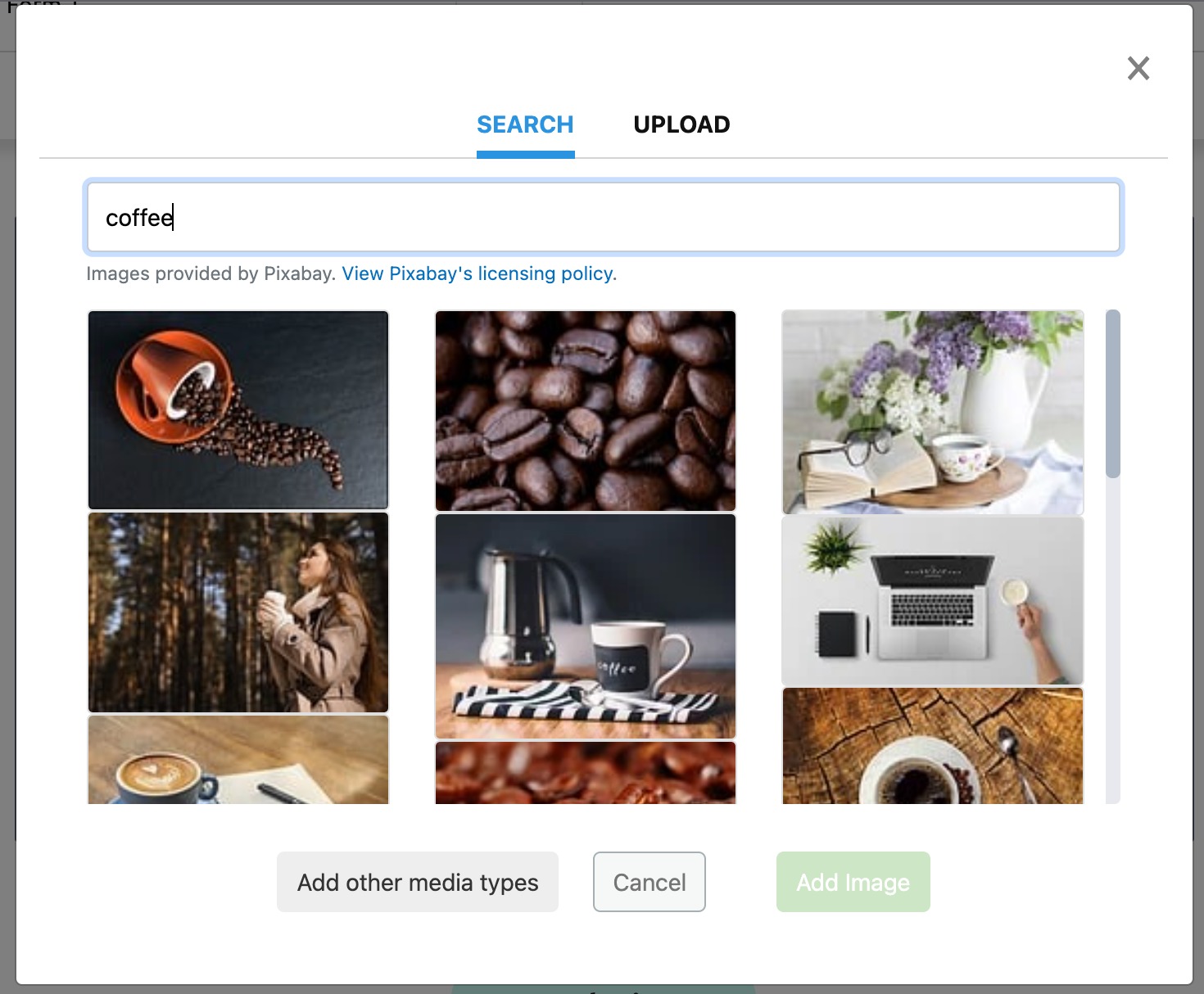
If you want to upload a video, audio file, or QR code, click “Add other media types.” This will close the current window, and open a new menu on the right. Here, you can select your preferred media type. If you’ve already uploaded an image, this will also enable you to adjust the image dimensions by pixel.
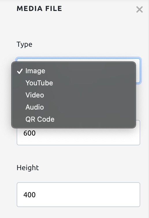
Select your preferred media type, and then click the cloud-shaped upload icon.
If you select “YouTube,” after clicking the upload icon, you will need to enter the URL of your selected video.
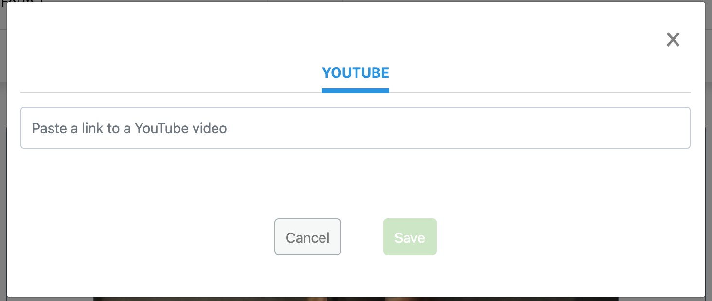
If you select Video or Audio, you will be directed to the Upload window.
Selecting QR Code will automatically generate a QR code that leads to a URL of your choice. Enter your selected URL using the Media File menu on the right.

If at any point you change your mind, you can select a new media type to upload using the “Type” dropdown in the Media File menu.
Headers, Subheaders, and Text
The Basics section contains three text-based fields: H1 Headers, H2 Subheaders, and text. Simply drag and drop each of these to place them on your form in your preferred spot, and type your content into the appropriate fields.
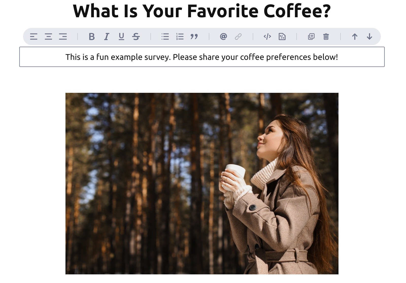
In this example, we placed a header and text field directly above our image, and used the alignment menu options to center them both:
Page Break + Logic Jump
Use the Page Break + Logic Jump element if you want to create a multi-page form. Drag and drop this element to create page breaks, where a user would need to click “Continue” to progress to the next page.

Contact Info
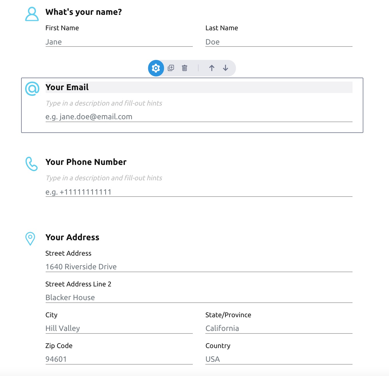
The Contact Info section contains form elements that you would use to collect contact information from users, including:
- Name
- Phone Number
- Address
Simply drag and drop each element you would like to include. Once they have been placed, you can edit the field titles, add a description (such as instructions) for each element, and rearrange elements as needed using the up and down arrows.
Questions
The Questions section allows you to create the following types of questions:
- Text (Short or Long)
- Multiple Choice (Text or Image)
- Dropdown
- Media Answer
Drag and drop your preferred question type to place it in your survey.
Text Questions
If you want your participants to type their own answers freely, use either short or long text questions. Short text questions provide a more limited answer space, whereas long text questions allow users to enter more detailed answers.
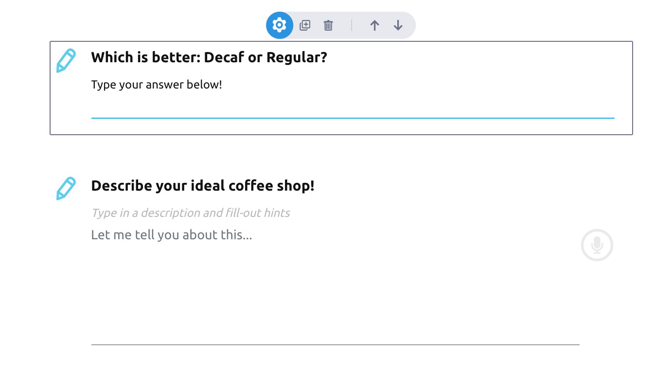
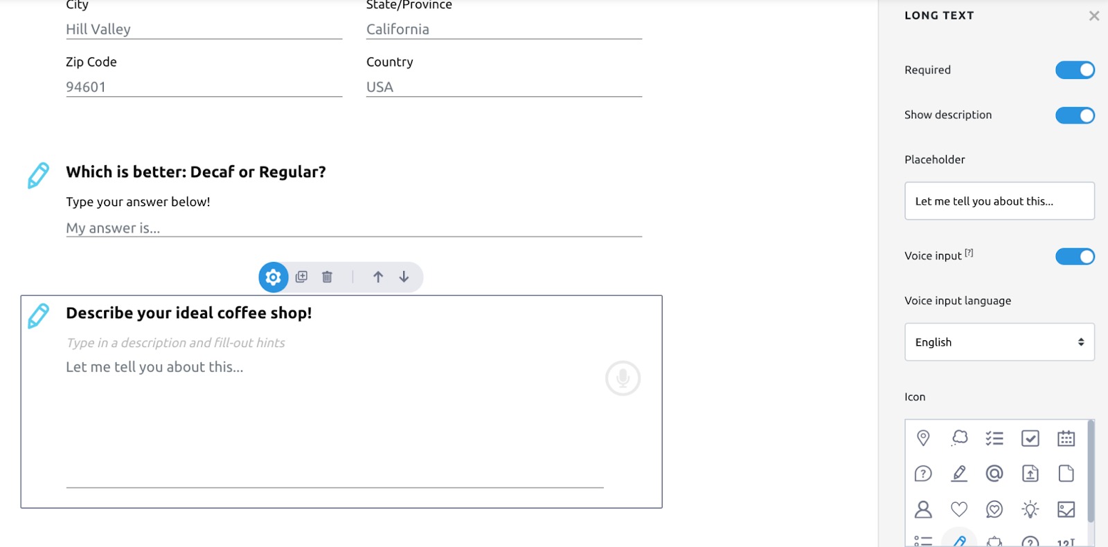
Click the gear icon above a question to further customize it. For example, you may mark a question as required or optional, show or remove the description field, customize your placeholder text, or customize the question icon.
Multiple Choice (Text or Image)
Lead Generation Forms includes two types of multiple choice questions: text or image-based.
For text-based multiple choice questions, simply drag and drop that question-type onto your form, and enter your preferred question and answer options.

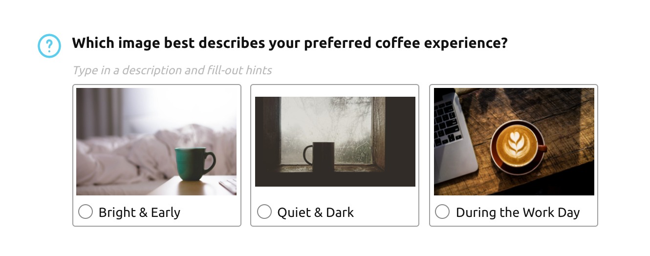
If you choose image-based multiple choice questions, you can browse or upload pictures for each answer option using the same method as previously described above under Media Files.
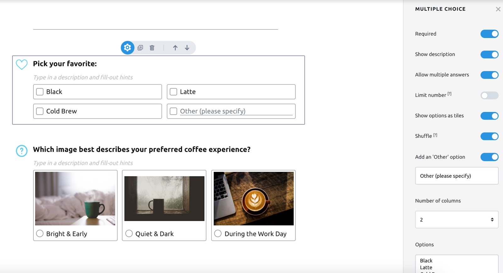
As with Text Questions, click the gear icon to further customize your multiple choice questions. For example, you can enable multiple answers (and limit the number of possible answers), add an “Other” option with a text field, and change the question layout.
Special
The Special section includes form elements that cannot be categorized elsewhere.
Special elements include:
- Date (e.g. if you want participants to schedule an appointment)
- Number (For questions with numerical answers like, “How many items would you be willing to buy?”)
- Website (for user-submitted URLs, such as an online portfolio)
- File Upload (e.g. a resume or C.V.)
- Captcha
- Digital Signature
Landing Pages
The Landing Pages section contains a design element called Cards:
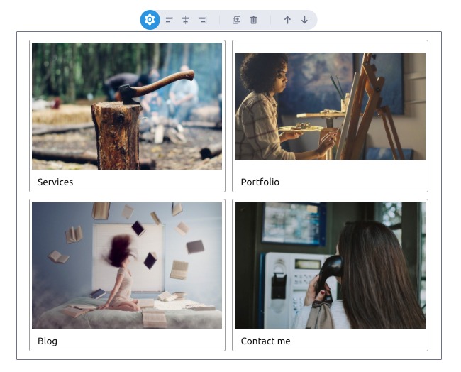
Each card contains a picture and a label. When you click on the gear icon, you can disable images, add or remove cards, and specify what action is taken when a user clicks on one. For example, when a user clicks on “Services,” they might be directed to the Services page on your company’s website.
Survey
The Survey section contains elements that enable users to rate their preferences or experiences on a scale. Options include:
- 5 Star Ratings
- Scale Ratings
- Matrix Ratings (Multiple connected scale ratings on one chart)
- Slider Ratings
Each rating system is fully customizable. For example, the default scale rating offers five options ranging from Very Poor to Excellent. However, users can add or remove options, and update each label according to preference.
Hidden
The Hidden section contains two fields that are not visible to users. These are not displayed on the published form, and can be used to help you analyze your results or customize your workflow.
Calculation
The Calculation field enables you to associate a numerical value with specific form responses, and calculate a number accordingly. For example, if a respondent chooses answer A, add 1. If they choose answer B, add 2.
You can use this field to estimate total costs (e.g. a monthly subscription payment), to create order forms, to calculate point values, and more.
First, drag and drop the Calculation element onto your form, and name your calculation.

Then click the gear icon to open the element settings and create your calculation. First, specify the starting value (the amount prior to any other values being added or subtracted), then click “Add Calculation.”
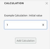
This will reveal the When/Then fields. Here, select a question and answer you want to consider in this calculation. When the answer matches, then your calculation will occur. In the example below, when the answer matches, we’ll add one to the starting value.
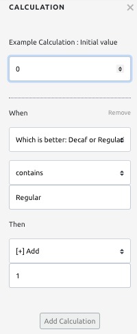
You may include multiple When/Then statements in your calculation. To add another statement, click “Add Calculation” and repeat the process accordingly.
To display the result on your form, first add a Text element wherever you want to display it. Then use an @ operator to select your calculation (the name you entered when adding the calculation to your form).

Formula
The Formula element allows you to write more complex and conditional calculations, using expressions from the math.js library.
You could use this to estimate prices conditional upon certain responses, to round calculations to a certain decimal place, or to write more complex, multi-statement calculations that could not be accomplished using the Calculation element.
First, drag and drop the Formula element onto your form. Then name your formula on the first line, and compose your formula on the second line.

To use data from another question in your formula, use the @ operator.
To display the results of your formula on the form itself, you may do so using a Text field and the @ operator, the same way you would display the results of your Calculation (described above).
Trivia Quiz
The Trivia Quiz section contains elements that enable you to test user knowledge and score accordingly.
Questions and Scores
The Questions and Scores element enables you to create test questions, and assign point values to correct answers. You can place this element by dragging and dropping it. Then, customize the text to create your test question.
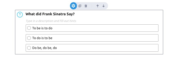
Once you have created your test question click the gear to customize the question settings. Two key features in the settings menu are the Score Calculation field and the Answers and Scores field.
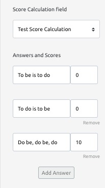
In the Answers and Scores field, you can assign point values to correct answers. These points will be used in your score calculation.
The Score Calculation field refers to the Hidden Field: Score Calculation element, which is covered below. Here, you can choose which score calculation you would like this question to relate to. You will need to specify this for every question you create.
Hidden Field: Score Calculation
Not visible to users, this field calculates a test score based on the point values you assigned when creating your questions using the Answers and Scores element.
To use it, drag and drop the element onto your quiz. Then, assign a unique name to your Score Calculation using the text field, so that you can identify it in the settings menu later.

Score Display
If you would like to display the user’s score, you can use the Score Display element.

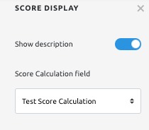
First, drag and drop. Then add your preferred element title and description. Finally, click the gear to open the settings menu for this element, and designate a Score Calculation to use for this field.
Checkboxes
The final section on the Form Elements menu, Checkboxes contains two elements that ask for a user’s consent.
First, the Terms and Conditions element asks them to confirm that they are aware of and consent to your terms. You can add a link to your terms and conditions using the settings menu (the gear icon).
Second, Newsletter Signup asks the participant to agree to be contacted by you (i.e. with newsletters and other digital communication).
Form Designer
In the Form Designer menu, you can customize the appearance of your form. If it is not visible, you can open the Form Designer menu by clicking on the blue droplet icon on the right.

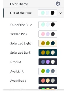
First, select your form’s color scheme. You have two options: ready-to-use Color Themes, and manually selected colors.
To select a ready-to-use color theme, use the dropdown near the top of the Form Designer menu, and select a theme that you like.
If you would like to manually select your colors, or to customize a premade theme, click the gear icon to bring up the Override Theme Colors window.
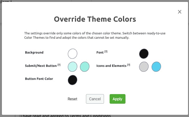
Click on a color you want to replace to select a new one. You can click on the hue you’re interested in using the color selector tool (resembling an eyedropper), or by entering the RGB, HSL, or HEX values for your preferred color.
Next, you can customize your background. You may choose to add either a background image, or a colored ribbon.
You can choose a background image first by enabling it in the menu.
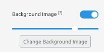
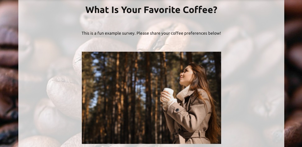
Then click “Change Background Image” to choose a Pixabay image or upload your own. Use the slider to adjust the opacity, to ensure that all the text on your form is clearly readable.
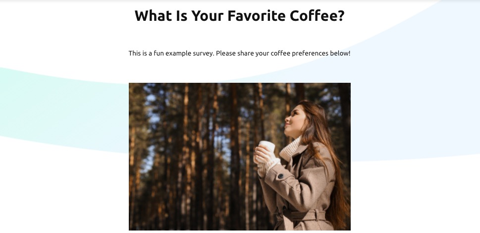
Enabling the Ribbon instead adds a colored stripe to the background of your form. You can use the slider to adjust the width of your colored ribbon.
Additional design customization options include:
- Enabling or disabling the footer
- Enabling or disabling question icons
- Customizing button style and size
- Customizing marks denoting optional/required questions
- Font family
- Form scale
- Font size
- Enabling or disabling the progress bar
Pro Tip: Sometimes, the finished product can look a little different than it does in the form builder, so when you are changing the design--especially with respect to background images and form scale--make sure you use Preview mode before finalizing. You can find Preview mode in the top right corner of the Form Builder.
Set Up
Once you’ve built your form, use the Set Up tab to prepare it for launch. The Set Up tab is broken up into five sections: General, SEO, PDF, Traits, and 3rd Party Integrations.
General
This section allows you to modify basic qualities and behaviors of your form. That includes:
- Form Name: The name you specified at the beginning of the creation process. You’ll use this to identify it in your Form List later.
- Form Language: Specify the primary language your form is written in.
- After Submit: Specify which action occurs once the completed form has been submitted by a user.
SEO
In the SEO section, you can customize fields that could impact your form’s organic search performance, including:
- Form Page Title: The title that appears in the browser tab when your form is open. This also acts as your meta title.
- Form Page Description: A short description of your page, which might appear in search results. This also acts as your meta description.
- Form page keywords: important words and phrases that can tell search engines what your form is about
The Response Inbox section, under the Results tab, generates PDF files of your form responses. In this section, you can customize what is included:
- Image and Text Fields: Enable this if you want to include images, headers, and text fields
- Hidden Text Fields: Enable this if you want to include hidden formulas and score calculations in your PDF
Traits
Under Traits, you can enable or disable many of the automatic behaviors of your form. Options include:
- Conversational UI: Enabling this option splits your form into pages, with only one input or question per page. Click “Configure” to customize button text, or to advance the form automatically once the correct fields have been completed.
- Automatic Save to Resume Later: Ensure respondents do not lose their answers if they close the page. Click “Configure” to allow users to continue where they left off when re-opening the form.
- Hide “Go Back” button: Prevents users from returning to the previous page to change their response.
- Autofocus: Automatically activates the first input field on each page.
- Key Bindings: Enables you to associate certain actions with keyboard commands
- Autoscroll: Automatically scrolls the form page so that the currently active field is centered.
3rd Party Integrations
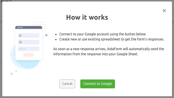
Here, you can enable and set up third-party integrations such as Google Sheets, which can collect your form responses to a spreadsheet for further analysis.
To enable it, first click on the tile. Then, follow the prompts to connect Lead Generation Forms to your Google account.
Publish
Once you’re ready to start collecting responses, you can use the Publish tab to make it publicly available.
- Form Status: Enable this to publish your form. This will make it publicly available.
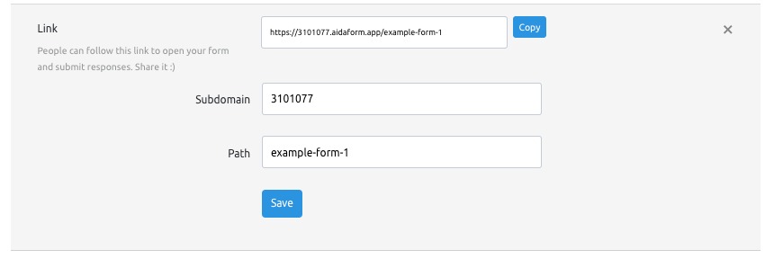
- Link: The URL people can follow to complete your form. Click “Change Link” to customize your URL by updating the Subdomain and Path according to your preference
- Embed on a web page: Use this code to embed your form on your site. Click “Configure” to customize the width, height, and embed scroll, which keeps your form within view.
Analysing the Results
Once you’ve published your form and begun collecting responses, you can use the Results tab to analyze them. The Results tab contains two parts: Completion Stats, which contains visualizations of data regarding your form responses, and the Response Inbox, where you can view individual responses.
Completion Stats
The Completion Stats tab analyzes statistics regarding how often your form was completed or abandoned, how users accessed it, and how those statistics change over time. Use the calendar dropdown menu in the header to select the time period you wish to analyze.
Summary
The Summary widget compares the total number of views to the number and share of responses (people who completed and submitted the form) and exits (people who closed the page without submitting the form).
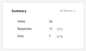
By default, this widget displays data across all devices. Click the dropdown arrow to filter by device type (Desktop, Mobile, or Tablet).
Top Devices
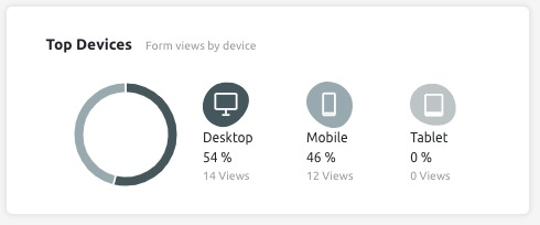
To the right of the Summary widget, Top Devices breaks down the share of form views by device type. On the left, a pie chart provides a visual representation of this data. To the right, you can find each device’s share of views.
Trends over Time
The Trends over Time widget contains two graphs, which can be viewed over daily, weekly, or monthly periods. Use the dropdown menu in the top right corner of the widget to change the period being viewed.
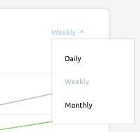
The top graph shows the trend of the number of responses and views received by your form during the specified time period.
Please note, the way this graph is displayed is determined by two factors simultaneously: The dates being viewed (selected in the header) and the period being analyzed (selected in the widget.)
Here is an example of how the Views and Responses graph looks when a “Last 7 Days” period was selected in the header, and “Weekly” was selected in the widget.

This is what the same graph looks like “Last 30 Days” was selected in the header, and “Weekly” was selected in the widget.

Below the Views and Responses graph, you’ll find a bar chart that compares the exit and completion rate during the specified period. As above, this graph may look different depending on the dates you selected in the header and the period you selected in the widget.

Response Inbox
After you publish your form, all of the responses will be collected in your Response Inbox. You can find this in the app header, to the right the Completion Stats tab.

The Response Inbox collects all the responses for the form you’re currently looking at. If you need to view the responses from a different form, you’ll first need to return to the Home screen and select the form you want to analyze.
You can filter your responses by time period using the calendar dropdown in the header. To do this, click on the down arrow beside your current date range and update according to your preferred date range.
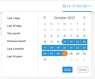
You can also filter your response inbox by read status using the filter in the top right corner of your Response Inbox. Click the down arrow to expand the filter menu (in the example below, it says “All responses”). You can choose between read, unread, and all responses.
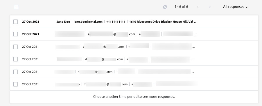
To delete one or more responses, or to change the read status, select them using the check boxes. Two menu options will appear at the top of your inbox Select the envelope icon to change the read status of the selected responses, and the trash icon to delete them.

To view a specific response in entirety, click on the corresponding subject line. Once you have opened the response, you may also print or download. Click the printer icon (on the right) to print it, and the down arrow (on the left) to download it.

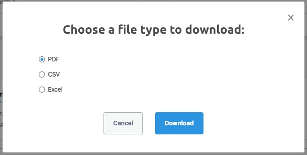
Once you click the download icon, you’ll be prompted to select your preferred file type: PDF, CSV, or Excel. Select the one that you want, and then click Download. To change what is included in your PDF, use the PDF menu in the Set Up section.
If you have other questions about the App Center or the Lead Generation Forms app, please email us directly at app-center@semrush.com.